Brand identity and packaging for Sanfrut
Client: Sanfrut
Project: Naming, visual identity, package design
Client: Sanfrut
Project: Naming, visual identity, package design
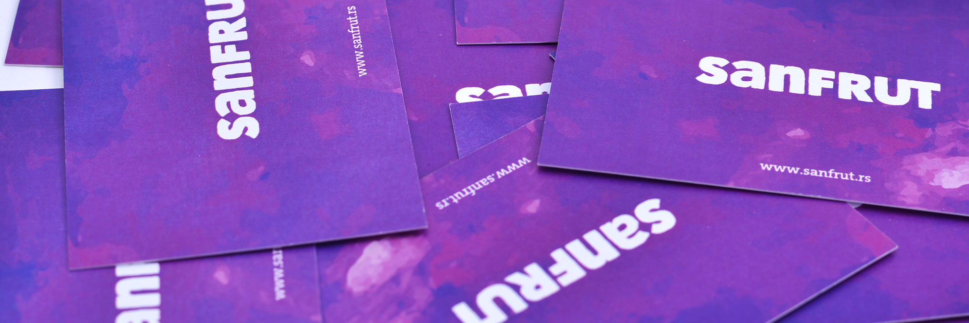
Čačak’s famous and today one of Serbia’s leading manufacturer of prunes asked us to create the company’s name, visual identity and packaging design. The name itself sums up the relation to fruit, sun, light; in general representing the company’s undertaking. The identity was designed to be dynamic and in dependence of the fruits’ color, change color. Packages of dried plum are designed in a manner that allows the potential customer to immediately see the content, prior to purchase, this not being the case with any other similar product of other manufacturers. Chocolate coated ones falls into the premium category; therefore the design and print technique for this packaging is at a very high level.


